Your guide to building and testing online accessibility
The huge increase in accessibility claims as a result of the shift to online learning should give those working in disability services pause for thought.
 6 min read
 Published: 4 Nov 2020
 Paul Davis, Ady Stokes and Luke Garbutt

While the ADA had its 30th birthday this summer, the huge increase in accessibility claims as a result of the shift to online learning should give those working in disability services pause for thought.
So how can you and your department ensure that accessibility is baked into your online presence, and how can you better identify errors?
We enlisted the help of two accessibility advocates here at Glean to help out, giving you guidance on simple steps you can take to ensure your online platforms don’t trip up.
Accessibility threads through every stage of development
First, I spoke to Paul, our product design lead. He’s been instrumental in ensuring Glean provides an accessible experience for people, no matter how they’re accessing it.
While Paul uses a series of essential rules for accessibility in design, he’s quick to point out that inclusion is always an evolving concern.
That’s why we’ve provided a quick guide to help you create accessible online spaces, but also a plan for testing your existing pages for accessibility.

A few accessibility maxims
To head off any major errors with online accessibility, it’s important to have a few ground rules when creating new content or opening up new platforms.
We’ll take you through a few of these now, starting with the inclusive design principles we’ve adopted to create Glean. This list was authored by a team of designers and accessibility advocates, and it’s available in a variety of formats.
The main theme uniting all of these principles is that inclusive design, while vital to some people, makes a better experience for all people.
1. Provide a comparable experience Ensure all people can access content in a way that suits their needs without compromising clarity or quality
2. Consider situation People access web pages and online platforms in a variety of environments and contexts. Ensure content is accessible no matter where or how it’s accessed (e.g. on mobile, outdoors)
3. Be consistent Use a few simple rules for text, design and layouts across all your pages and stick to them
4. Give control Don’t place unnecessary restrictions on how a user can interact with or access your page (e.g page orientation, font size).
5. Offer choice Provide multiple ways for a user to complete an action, browse information (such as choice between grid or list layouts) and access content
6. Prioritize content Ultimately, a page or platform should be geared towards communicating its core message(s) and highlighting important actions without unnecessary distractions or information-overload.
7. Add value Always ask how much a feature is improving user experience. Think about the purpose of everything you do on-site, and how that will add value to people.
How these rules have shaped Glean
To illustrate these points, let’s have a look at a selection of features within Glean designed to provide a better experience for all users. We spoke to Paul Davis our Product Design Lead @ Glean
Give control
Don’t place unnecessary restrictions on how a user can interact with or access your page.
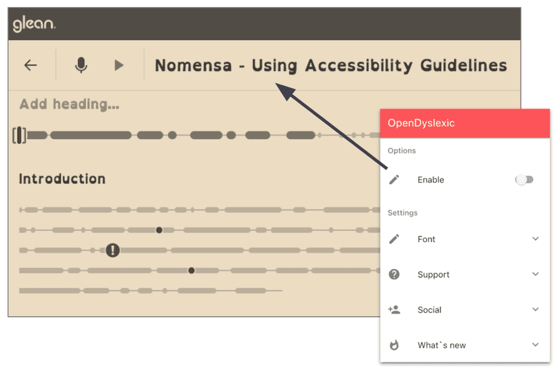
The first example is really simple: allow users to override default design choices like font, text size and colours.
When designing every element of Glean we test the interface to ensure that we are not preventing the user from tailoring the interface to better meet their needs. This may be adjusting the font size in the browser or using a chrome extension to change the colours or font.
Offer choice
Provide multiple ways for a user to complete an action, browse information and access content
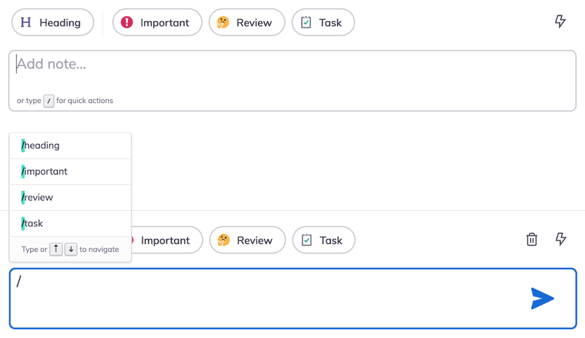
During the development of Glean we received feedback from a number of students suggesting that it would be helpful if there was a way to highlight notes using a keyboard, removing the need to use the trackpad or mouse.
Although it was already possible to navigate Glean using a keyboard, tabbing through the controls on screen was not efficient enough for students taking notes at speed. To meet the needs of our note takers we introduced the ability to add headings and labels by typing forward slash and the first letter of the chosen action.
Be consistent
Use a few simple rules for text, design and layouts across all your pages and stick to them
When designing features for Glean we need to consider the experience for both the web and mobile app. To help build understanding across the two devices we maintain the same design patterns where possible. By following the principle of consistency, users only need to learn how to perform the same task once.
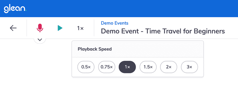
When designing the user interface for adjusting the audio playback speed, we followed the principle of consistency and used the same interface controls for selecting your chosen speed across both devices.
Identifying and fixing accessibility issues
I spoke to Ady Stokes, our test engineer and accessibility advocate. For Ady, there are 3 main areas you need to examine in any accessibility test.
Ady Stokes, Test Engineer and Accessibility Advocate @ Glean

1. Visuals
Is your site laid out logically? How easy is it to get around? A common error in websites is changing layouts as you move from page to page.
Having navigation and menu elements in the same place on every page not only makes sites easier to use and get used to, they significantly improve experiences for people who cannot see the page and are using assistive technology like a screen reader.
Beware of ‘keyboard traps’. A number of people navigate your site using only the keyboard as they cannot or prefer not to use a mouse. For people who cannot see or have low vision a keyboard, or assistive technology that represents a keyboard, is the only way they can interact with your site.
How easy do you find using your site without a mouse? Do you get stuck when you try to do this? If so, you’ve got an issue with site navigation that will need fixing.
A ‘keyboard trap’ is an area that you can navigate to but can’t get out of. This can be due to how the tabbing order is implemented, or missing tab areas such as close buttons on pop ups. You’d be amazed by how many website issues occur because of a lack of understanding of tabbing!
Getting color contrasts right is important. Websites often trip up over this issue, so it’s important to make sure you’re not creating obstacles for people with visual impairments or colour vision deficiencies.
Readability trumps all. If the purpose of your site or page is to convey useful information to students, make this as easy to understand as possible. Generally speaking, if there’s a simpler way to explain something, that’s the right option to pick.
A couple of other points:
Avoid dense blocks of text, and ensure you use Headings appropriately.
If you are using one or more acronyms, make sure you define them the first time they are used.
2. Hearing
All content and actions must be available to screen readers. For someone using a screen reader who cannot see, what they hear is the only information they have. If actions happen and are not announced, such as submitting a form, resetting a password or simply logging in, then it is easy for them to lose their position on the screen or become frustrated with your site.
Alternative text (alt-text) for images isn’t always necessary. Sometimes, if an image is there for only decorative reasons or to reflect information already in the text of a page, it might not be necessary to add alt-text at all. Keep in mind what a screen reader will pick up while scanning a page. If you feel you have to use alt-text, keep it simple and to the point.
Screen readers identify elements, so will say, ‘image’ before reading the alt-text. If your description says, ‘image of’ or picture of’ this becomes ‘image image of’ or ‘image picture of’ which not only sounds strange but is totally unnecessary.
Always have descriptions for links on your site. Screen readers have multiple ways of providing information on a website. They can scan via headings, links or other elements, so if all your links say ‘click here’ or ‘read more’ that isn’t going to be useful. It’s much better to have a full description of where the link is going so they understand what to expect.
3. Interactions
Do you have an embedded video on your site? It’s important to remember that to be accessible, there must be a way for all people to pause, stop or remove the video from the browsing experience. Otherwise, you’ve created a potential obstacle.
Ady’s tips for monitoring online accessibility:
- Test your site using only your keyboard
- Compare the screen reader experience with a sighted person
- Use Chrome plugins to scan for issues
- Inclusive and Universal design is better design
- Think about how people will be accessing content in a different way
- Consistency is key
Tools can help but be wary
Why be wary? Automated accessibility tools are not infallible. They can flag ‘false positives’, i.e. things that don’t qualify as accessibility issues. It is also important that you take the time to understand what is flagged, what it means and what the criteria is compared against. Trust me, it’s worth the effort!
WAVE, web accessibility evaluation. This is my main recommendation as a tool although there are plenty of others available. This tool assesses accessibility in a number of ways, including scanning for common issues, errors, low contrast and more. https://wave.webaim.org/extension/
What to do if you spot an issue
If you, or a member of your team, spots an issue with accessibility, it’s important to lay things out as simply as you can. Ady likes to use a ‘What, Who and How’ system to point out errors and suggest remedies. That means;
What is the issue?
Who does it affect?
How can we fix or improve this?
For example,
What: The color contrast is too low on the banner of our web page
Who: Visitors with visual impairments or colour vision deficiencies may have trouble reading it
How: Adjust color contrast on logo to (specifications) if they do not match, or change our specification moving shades further apart.
Accessible note taking, no matter the context
In person and online, Glean helps your students take notes independently. Accessibility has been a part of its journey from inception to rollout, and we’re committed to providing a great note taking experience no matter how students access technology.
Written by Luke Garbutt

More from Supporting Students
View All
 5 min read
Understanding and supporting students with barriers in higher education
Take a deeper look into students with barriers to learner. Here, we discuss who they are, what challenges they face and what institutions can do to support them.
 3 min read
Understanding and supporting time poor students in higher education
Here, we take a deeper dive into who the time poor learners are, and their unique challenges. Explore strategies to support students juggling multiple roles and responsibilities, to create a more inclusive and flexible learning environment.

 3 min read
Navigating the AI landscape in education: Helping or hindering student success
AI has transformed what it means to teach and to learn. It is crucial now for higher education leaders to determine how they deploy AI to help, rather than hinder, student success.


